ai
Responsive Web Design Free — เรียนรู้ Responsive
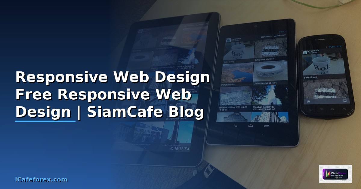
Responsive Web Design
Responsive Web Design ออกแบบเว็บแสดงผลดีทุกขนาดหน้าจอ Desktop Tablet Mobile ใช้ Media Queries Flexible Grids Images ปรับ Layout อัตโนมัติ
เนื้อหาเกี่ยวข้อง — ดูเพิ่มเติมเรื่อง Airbyte ETL Troubleshooting แก้ปัญหา
Mobile-first Design ออกแบบ Mobile ก่อน เพิ่ม Features หน้าจอใหญ่ เว็บโหลดเร็ว Mobile เป็นอุปกรณ์ส่วนใหญ่
เนื้อหาเกี่ยวข้อง — แนะนำให้อ่าน การลงทุนแบบ dca คือ
CSS Media Queries และ Breakpoints
/* === Responsive Web Design — CSS === */

/* 1. Mobile-first Base Styles */
* {
  margin: 0;
  padding: 0;
  box-sizing: border-box;
}

body {
  font-family: 'Sarabun', sans-serif;
  font-size: 16px;
  line-height: 1.6;
  color: #333;
}

.container {
  width: 100%;
  max-width: 1200px;
  margin: 0 auto;
  padding: 0 16px;
}

/* 2. Navigation — Mobile First */
.navbar {
  display: flex;
  flex-wrap: wrap;
  justify-content: space-between;
  align-items: center;
  padding: 12px 16px;
  background: #1a1a2e;
  color: white;
}

.nav-logo {
  font-size: 1.5rem;
  font-weight: bold;
}

.nav-toggle {
  display: block;
  background: none;
  border: none;
  color: white;
  font-size: 1.5rem;
  cursor: pointer;
}

.nav-menu {
  display: none;
  width: 100%;
  flex-direction: column;
  list-style: none;
  padding: 16px 0;
}

.nav-menu.active {
  display: flex;
}

.nav-menu li a {
  display: block;
  padding: 8px 0;
  color: white;
  text-decoration: none;
}

/* 3. Grid Layout — Mobile First */
.grid {
  display: grid;
  grid-template-columns: 1fr;
  gap: 16px;
  padding: 16px 0;
}

.card {
  background: white;
  border-radius: 8px;
  box-shadow: 0 2px 8px rgba(0,0,0,0.1);
  overflow: hidden;
}

.card img {
  width: 100%;
  height: auto;
  display: block;
}

.card-body {
  padding: 16px;
}

/* 4. Responsive Images */
img {
  max-width: 100%;
  height: auto;
}

/* === Media Queries — Breakpoints === */

/* Tablet (768px+) */
@media (min-width: 768px) {
  .nav-toggle { display: none; }
  .nav-menu {
    display: flex;
    width: auto;
    flex-direction: row;
    gap: 24px;
    padding: 0;
  }
  .grid {
    grid-template-columns: repeat(2, 1fr);
    gap: 24px;
  }
  .container { padding: 0 24px; }
}

/* Desktop (1024px+) */
@media (min-width: 1024px) {
  .grid {
    grid-template-columns: repeat(3, 1fr);
    gap: 32px;
  }
  .container { padding: 0 32px; }
  body { font-size: 18px; }
}

/* Large Desktop (1200px+) */
@media (min-width: 1200px) {
  .grid {
    grid-template-columns: repeat(4, 1fr);
  }
}

/* Print Styles */
@media print {
  .navbar, .nav-toggle { display: none; }
  body { font-size: 12pt; color: black; }
  a { text-decoration: underline; }
}
Flexbox และ CSS Grid Layout

/* === Flexbox Layout === */

/* Hero Section */
.hero {
  display: flex;
  flex-direction: column;
  align-items: center;
  text-align: center;
  padding: 48px 16px;
  background: linear-gradient(135deg, #667eea 0%, #764ba2 100%);
  color: white;
}

.hero h1 {
  font-size: clamp(1.5rem, 5vw, 3rem);
  margin-bottom: 16px;
}

.hero p {
  font-size: clamp(1rem, 2.5vw, 1.25rem);
  max-width: 600px;
}

/* Flex Card Row */
.card-row {
  display: flex;
  flex-wrap: wrap;
  gap: 16px;
}

.card-row .card {
  flex: 1 1 280px;
  min-width: 0;
}

/* Footer */
.footer {
  display: flex;
  flex-wrap: wrap;
  justify-content: space-between;
  gap: 32px;
  padding: 48px 16px;
  background: #1a1a2e;
  color: #ccc;
}

.footer-col {
  flex: 1 1 200px;
}

/* === CSS Grid — Page Layout === */
.page-layout {
  display: grid;
  grid-template-areas:
    "header"
    "main"
    "sidebar"
    "footer";
  gap: 16px;
}

.page-header  { grid-area: header; }
.page-main    { grid-area: main; }
.page-sidebar { grid-area: sidebar; }
.page-footer  { grid-area: footer; }

@media (min-width: 768px) {
  .page-layout {
    grid-template-columns: 1fr 300px;
    grid-template-areas:
      "header  header"
      "main    sidebar"
      "footer  footer";
  }
}

/* CSS Grid — Auto-fit */
.auto-grid {
  display: grid;
  grid-template-columns: repeat(auto-fit, minmax(250px, 1fr));
  gap: 24px;
}

/* Responsive Typography — clamp() */
h1 { font-size: clamp(1.5rem, 4vw, 3rem); }
h2 { font-size: clamp(1.25rem, 3vw, 2rem); }
h3 { font-size: clamp(1rem, 2.5vw, 1.5rem); }

/* Responsive Spacing */
.section {
  padding: clamp(24px, 5vw, 64px) clamp(16px, 3vw, 32px);
}

/* Aspect Ratio */
.video-container {
  aspect-ratio: 16 / 9;
  width: 100%;
  background: #000;
}

/* Container Queries (Modern CSS) */
/* @container (min-width: 400px) {
  .card-body { display: flex; gap: 16px; }
} */
JavaScript Responsive Helpers
// === Responsive JavaScript Helpers ===

// 1. Responsive Navigation Toggle
document.addEventListener('DOMContentLoaded', () => {
  const toggle = document.querySelector('.nav-toggle');
  const menu = document.querySelector('.nav-menu');

  if (toggle && menu) {
    toggle.addEventListener('click', () => {
      menu.classList.toggle('active');
      const expanded = toggle.getAttribute('aria-expanded') === 'true';
      toggle.setAttribute('aria-expanded', !expanded);
    });

    // Close menu on resize to desktop
    window.addEventListener('resize', () => {
      if (window.innerWidth >= 768) {
        menu.classList.remove('active');
      }
    });
  }
});

// 2. Lazy Loading Images
const lazyImages = document.querySelectorAll('img[data-src]');
const imageObserver = new IntersectionObserver((entries) => {
  entries.forEach(entry => {
    if (entry.isIntersecting) {
      const img = entry.target;
      img.src = img.dataset.src;
      img.removeAttribute('data-src');
      imageObserver.unobserve(img);
    }
  });
});
lazyImages.forEach(img => imageObserver.observe(img));

// 3. Responsive Breakpoint Detection
const breakpoints = {
  mobile: 480,
  tablet: 768,
  desktop: 1024,
  large: 1200,
};

function getCurrentBreakpoint() {
  const width = window.innerWidth;
  if (width < breakpoints.mobile) return 'mobile';
  if (width < breakpoints.tablet) return 'tablet';
  if (width < breakpoints.desktop) return 'desktop';
  return 'large';
}

// 4. Responsive Table
function makeTableResponsive(table) {
  const headers = Array.from(table.querySelectorAll('th'))
    .map(th => th.textContent);

  table.querySelectorAll('tbody tr').forEach(row => {
    row.querySelectorAll('td').forEach((cell, index) => {
      cell.setAttribute('data-label', headers[index] || '');
    });
  });
}

// 5. Performance — Debounce Resize
function debounce(func, wait = 250) {
  let timeout;
  return function(...args) {
    clearTimeout(timeout);
    timeout = setTimeout(() => func.apply(this, args), wait);
  };
}

window.addEventListener('resize', debounce(() => {
  console.log('Breakpoint:', getCurrentBreakpoint());
}));

console.log('Responsive Helpers loaded');
console.log('Current breakpoint:', getCurrentBreakpoint());
เครื่องมือฟรี
- Chrome DevTools: กด F12 ใช้ Device Toolbar ทดสอบขนาดหน้าจอต่างๆ
- Responsively App: แสดงเว็บหลายขนาดพร้อมกัน ฟรี Open Source
- CSS Frameworks: TailwindCSS, Bootstrap ให้ Responsive Utilities ฟรี
- Google Mobile Test: ทดสอบว่าเว็บ Mobile-friendly หรือไม่
- PageSpeed Insights: วัด Performance บน Mobile และ Desktop
- Can I Use: ตรวจสอบ CSS Feature Support บน Browser ต่างๆ
Responsive Web Design คืออะไร
เทคนิคออกแบบเว็บแสดงผลดีทุกขนาดหน้าจอ Desktop Tablet Mobile CSS Media Queries Flexible Grids Images ปรับ Layout อัตโนมัติ ไม่ต้องสร้างเว็บแยก Mobile
แนะนำเพิ่มเติม — อ่านเพิ่มเติมที่ SiamCafeBook
เนื้อหาเกี่ยวข้อง — ดูเพิ่มเติมเรื่อง Computer Vision YOLO Pod Scheduling