ในปี 2026 shadcn/ui กลายเป็น Component Library ที่ได้รับความนิยมสูงสุดในวงการ React/Next.js เพราะแนวคิดที่ต่างจาก Library ทั่วไป คุณไม่ต้อง npm install อะไรเลย แค่ Copy-Paste Code เข้าโปรเจกต์ของคุณ แล้ว Customize ได้ตามต้องการ
shadcn/ui คืออะไร?
shadcn/ui ไม่ใช่ Component Library ในความหมายปกติ ไม่ใช่ Package ที่คุณ Install จาก npm แต่เป็น Collection ของ Re-usable Components ที่คุณ Copy เข้าโปรเจกต์ของคุณเอง
| เกณฑ์ | shadcn/ui | MUI (Material UI) | Chakra UI |
|---|---|---|---|
| วิธีใช้ | Copy-Paste / CLI | npm install | npm install |
| Dependency | ไม่มี (Code เป็นของคุณ) | ต้อง import จาก Package | ต้อง import จาก Package |
| Customization | แก้ Code ได้ 100% | ผ่าน Theme/Props | ผ่าน Theme/Props |
| Styling | Tailwind CSS | CSS-in-JS (Emotion) | CSS-in-JS |
| Accessibility | Radix Primitives (ดีมาก) | ดี | ดี |
| Bundle Size | เล็กมาก (ใช้แค่ที่ต้องการ) | ใหญ่ | ปานกลาง |
| Update | คุณ Control เอง | ต้อง Update Package | ต้อง Update Package |
เริ่มต้นใช้ shadcn/ui
# 1. สร้างโปรเจกต์ Next.js (ถ้ายังไม่มี):
npx create-next-app@latest my-app --typescript --tailwind --eslint
# 2. Initialize shadcn/ui:
cd my-app
npx shadcn@latest init
# CLI จะถาม:
# - Style: Default / New York
# - Base color: Slate / Gray / Zinc / Neutral / Stone
# - CSS variables: Yes (แนะนำ)
#
# สร้างไฟล์:
# - components.json (Config)
# - lib/utils.ts (cn utility)
# - globals.css (CSS variables)
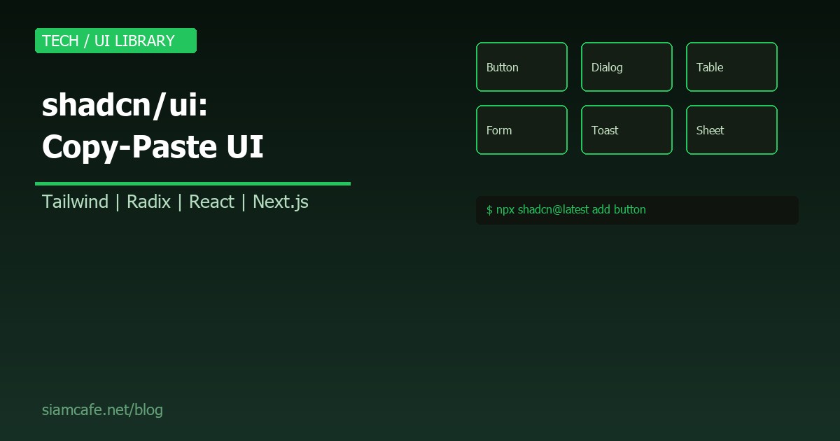
# 3. เพิ่ม Component:
npx shadcn@latest add button
npx shadcn@latest add dialog
npx shadcn@latest add table
npx shadcn@latest add form
npx shadcn@latest add toast
# Component จะถูกสร้างใน:
# components/ui/button.tsx
# components/ui/dialog.tsx
# etc.
# เป็น Code ของคุณ! แก้ไขได้เลย!Tailwind CSS Foundation
shadcn/ui สร้างบน Tailwind CSS ทั้งหมด ถ้ายังไม่เคยใช้ Tailwind ต้องเรียนรู้พื้นฐานก่อน
// ตัวอย่าง Button ใน shadcn/ui:
import { Button } from "@/components/ui/button"

// Variants ที่มีให้:
<Button variant="default">Default</Button>
<Button variant="destructive">Delete</Button>
<Button variant="outline">Outline</Button>
<Button variant="secondary">Secondary</Button>
<Button variant="ghost">Ghost</Button>
<Button variant="link">Link</Button>

// Sizes:
<Button size="sm">Small</Button>
<Button size="default">Default</Button>
<Button size="lg">Large</Button>
<Button size="icon"><Icon /></Button>
Radix Primitives — Accessibility ระดับสูง
shadcn/ui ใช้ Radix UI Primitives เป็นพื้นฐาน ซึ่งจัดการ Accessibility (a11y) ให้ทั้งหมด: keyboard navigation, screen reader, focus management, ARIA attributes
// Dialog ตัวอย่าง (Radix-based):
import {
  Dialog,
  DialogContent,
  DialogDescription,
  DialogHeader,
  DialogTitle,
  DialogTrigger,
} from "@/components/ui/dialog"

<Dialog>
  <DialogTrigger asChild>
    <Button variant="outline">Open Dialog</Button>
  </DialogTrigger>
  <DialogContent>
    <DialogHeader>
      <DialogTitle>Are you sure?</DialogTitle>
      <DialogDescription>
        This action cannot be undone.
      </DialogDescription>
    </DialogHeader>
    <div className="flex justify-end gap-2">
      <Button variant="outline">Cancel</Button>
      <Button variant="destructive">Delete</Button>
    </div>
  </DialogContent>
</Dialog>

// Radix ให้ฟรี:
// - ESC ปิด Dialog
// - Tab/Shift+Tab navigate ใน Dialog
// - Focus trap (focus ไม่หลุดออก Dialog)
// - Screen reader อ่าน Title/Description
// - Overlay click ปิด Dialog
cn() Utility — Merge Tailwind Classes
// lib/utils.ts
import { clsx, type ClassValue } from "clsx"
import { twMerge } from "tailwind-merge"

export function cn(...inputs: ClassValue[]) {
  return twMerge(clsx(inputs))
}

// cn() ช่วยรวม Tailwind classes อย่างถูกต้อง:
cn("px-4 py-2", "px-8")
// → "px-8 py-2" (px-4 ถูกแทนที่ด้วย px-8)

// ใช้กับ Conditional classes:
cn(
  "rounded-md font-medium",
  isActive && "bg-primary text-white",
  isDisabled && "opacity-50 cursor-not-allowed"
)
Dark Mode
// shadcn/ui รองรับ Dark Mode ผ่าน CSS Variables:

// globals.css:
@layer base {
  :root {
    --background: 0 0% 100%;
    --foreground: 222.2 84% 4.9%;
    --primary: 222.2 47.4% 11.2%;
    /* ... */
  }

  .dark {
    --background: 222.2 84% 4.9%;
    --foreground: 210 40% 98%;
    --primary: 210 40% 98%;
    /* ... */
  }
}

// Toggle Dark Mode:
// ใช้ next-themes:
// npm install next-themes

import { useTheme } from "next-themes"

function ThemeToggle() {
  const { theme, setTheme } = useTheme()
  return (
    <Button onClick={() => setTheme(theme === "dark" ? "light" : "dark")}>
      Toggle Theme
    </Button>
  )
}
Form + React Hook Form + Zod
// shadcn/ui Form = React Hook Form + Zod Validation
npx shadcn@latest add form input

// ตัวอย่าง Login Form:
import { zodResolver } from "@hookform/resolvers/zod"
import { useForm } from "react-hook-form"
import * as z from "zod"
import { Button } from "@/components/ui/button"
import { Form, FormControl, FormField, FormItem, FormLabel, FormMessage } from "@/components/ui/form"
import { Input } from "@/components/ui/input"

const formSchema = z.object({
  email: z.string().email("Email ไม่ถูกต้อง"),
  password: z.string().min(8, "รหัสผ่านต้องมีอย่างน้อย 8 ตัวอักษร"),
})

function LoginForm() {
  const form = useForm<z.infer<typeof formSchema>>({
    resolver: zodResolver(formSchema),
    defaultValues: { email: "", password: "" },
  })

  function onSubmit(values: z.infer<typeof formSchema>) {
    console.log(values)
  }

  return (
    <Form {...form}>
      <form onSubmit={form.handleSubmit(onSubmit)} className="space-y-4">
        <FormField control={form.control} name="email" render={({ field }) => (
          <FormItem>
            <FormLabel>Email</FormLabel>
            <FormControl><Input placeholder="email@example.com" {...field} /></FormControl>
            <FormMessage />
          </FormItem>
        )} />
        <FormField control={form.control} name="password" render={({ field }) => (
          <FormItem>
            <FormLabel>Password</FormLabel>
            <FormControl><Input type="password" {...field} /></FormControl>
            <FormMessage />
          </FormItem>
        )} />
        <Button type="submit">Login</Button>
      </form>
    </Form>
  )
}
Data Table
// shadcn/ui Data Table = TanStack Table (React Table v8)
npx shadcn@latest add table

// สร้าง Data Table ที่มี:
// - Sorting
// - Filtering
// - Pagination
// - Row Selection
// - Column Visibility

// ดูตัวอย่างเต็ม: ui.shadcn.com/docs/components/data-table
Toast Notifications
npx shadcn@latest add toast

// ใช้ Toast:
import { useToast } from "@/hooks/use-toast"

function MyComponent() {
  const { toast } = useToast()

  return (
    <Button onClick={() => toast({
      title: "Success!",
      description: "บันทึกข้อมูลเรียบร้อยแล้ว",
    })}>
      Save
    </Button>
  )
}
Theming — CSS Variables
// เปลี่ยน Theme ด้วย CSS Variables:
// globals.css

@layer base {
  :root {
    --primary: 142 76% 36%;          /* Green */
    --primary-foreground: 0 0% 100%;
    --radius: 0.5rem;                 /* Border radius */
  }
}

// หรือใช้ Theme Generator:
// ui.shadcn.com/themes
// เลือกสี แล้ว Copy CSS Variables มาใส่
shadcn/ui กับ Frameworks อื่น
| Framework | สถานะ | วิธีใช้ |
|---|---|---|
| Next.js | Official Support | npx shadcn@latest init |
| Vite + React | Official Support | npx shadcn@latest init |
| Remix | Official Support | npx shadcn@latest init |
| Astro | Official Support | npx shadcn@latest init |
| Vue (shadcn-vue) | Community Port | npx shadcn-vue@latest init |
| Svelte (shadcn-svelte) | Community Port | npx shadcn-svelte@latest init |
เมื่อไรควรเลือก shadcn/ui?
| เลือก shadcn/ui เมื่อ | ไม่เลือก shadcn/ui เมื่อ |
|---|---|
| ต้องการ Customize มาก | ต้องการ Component สำเร็จรูปเลย |
| ใช้ Tailwind CSS อยู่แล้ว | ไม่อยากเรียน Tailwind |
| ต้องการ Bundle Size เล็ก | ไม่สนใจ Bundle Size |
| ต้องการ Control เต็ม | ต้องการ Design System สำเร็จรูป |
| ใช้ React/Next.js | ใช้ Angular หรือ Framework อื่น |
สรุป
shadcn/ui เปลี่ยนวิธีคิดเกี่ยวกับ Component Library จาก "Install Package แล้วใช้" เป็น "Copy Code แล้ว Own" คุณได้ Component ที่สวย Accessible และ Customizable 100% โดยไม่ต้องพึ่ง Dependency ภายนอก เริ่มต้นด้วย npx shadcn@latest init แล้วสร้าง UI ที่ต้องการได้ทันที