Responsive Web Design ข้อดี — ออกแบบเว็บ
Responsive Web Design คืออะไร

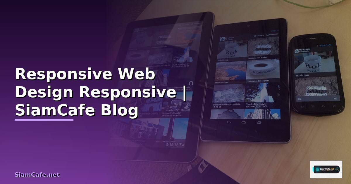
Responsive Web Design (RWD) เป็นแนวทางออกแบบเว็บไซต์ที่ปรับ layout และ content ให้เหมาะกับขนาดหน้าจอทุกอุปกรณ์ ตั้งแต่ mobile phones, tablets, laptops จนถึง desktop monitors คิดค้นโดย Ethan Marcotte ในปี 2010 ใช้ 3 เทคนิคหลัก Fluid Grids ใช้หน่วย percentage แทน fixed pixels, Flexible Images ปรับขนาดรูปภาพตาม container, Media Queries กำหนด CSS rules ตามขนาดหน้าจอ
ในปี 2025 การทำ Responsive Design สำคัญมากขึ้นเพราะ mobile traffic คิดเป็น 60%+ ของ web traffic ทั้งหมด Google ใช้ Mobile-First Indexing จัดอันดับเว็บไซต์ ผู้ใช้คาดหวังประสบการณ์ที่ดีบนทุกอุปกรณ์ อุปกรณ์มีหลากหลายขนาดหน้าจอมากขึ้น ตั้งแต่ smartwatch, foldable phones จนถึง ultra-wide monitors
ข้อดีของ Responsive Web Design
ประโยชน์หลักของ RWD
=== ข้อดีของ Responsive Web Design ===
1. SEO Benefits
- Google Mobile-First Indexing: Google crawl mobile version ก่อน
- Single URL: ไม่ต้องแยก m.example.com กับ example.com
- ลด duplicate content issues
- Core Web Vitals: responsive sites มี LCP, FID, CLS ดีกว่า
- Higher rankings: Google ให้ความสำคัญกับ mobile-friendly sites
2. User Experience (UX)
- Consistent experience ทุกอุปกรณ์
- ไม่ต้อง pinch-to-zoom บน mobile
- Navigation ใช้งานง่ายบน touch screens
- Content อ่านง่ายทุกขนาดหน้าจอ
- Reduce bounce rate 30-50%
3. Cost Efficiency
- Maintain codebase เดียว (ไม่ต้องแยก mobile site)
- ลดเวลา development 30-40%
- ลดค่า hosting (single site)
- Content update ครั้งเดียวใช้ได้ทุกอุปกรณ์
- QA testing ง่ายกว่า (ไม่ต้อง test 2 sites)
4. Business Impact
- เพิ่ม conversion rate 20-30% (mobile users)
- ลด bounce rate
- เพิ่ม time on site
- รองรับ future devices อัตโนมัติ
- Brand consistency ทุก touchpoints
5. Technical Benefits
- Single codebase = ง่ายต่อ maintenance
- ใช้ร่วมกับ modern CSS features (Grid, Flexbox, Container Queries)
- Progressive Enhancement approach
- Better accessibility
- Easier analytics tracking (single URL)
6. Statistics (2025)
- 60.67% ของ web traffic มาจาก mobile
- 73% ของ users ออกจาก site ที่ไม่ responsive
- Mobile-friendly sites มี conversion สูงกว่า 64%
- Google penalizes non-responsive sites ใน search rankings
- 85% ของ adults คิดว่า mobile site ควรดีเท่าหรือดีกว่า desktop
echo "RWD benefits overview"
เทคนิค Responsive ด้วย CSS
CSS techniques สำหรับ Responsive Design
/* === Responsive CSS Techniques === */

/* 1. Media Queries — Mobile First Approach */
/* Base styles (mobile) */
.container {
  width: 100%;
  padding: 0 16px;
  margin: 0 auto;
}

.grid {
  display: grid;
  grid-template-columns: 1fr;
  gap: 16px;
}

/* Tablet (768px+) */
@media (min-width: 768px) {
  .container {
    max-width: 720px;
  }
  .grid {
    grid-template-columns: repeat(2, 1fr);
    gap: 24px;
  }
}

/* Desktop (1024px+) */
@media (min-width: 1024px) {
  .container {
    max-width: 960px;
  }
  .grid {
    grid-template-columns: repeat(3, 1fr);
    gap: 32px;
  }
}

/* Large Desktop (1280px+) */
@media (min-width: 1280px) {
  .container {
    max-width: 1200px;
  }
  .grid {
    grid-template-columns: repeat(4, 1fr);
  }
}

/* 2. Fluid Typography — clamp() */
h1 {
  font-size: clamp(1.75rem, 4vw, 3rem);
  line-height: 1.2;
}

h2 {
  font-size: clamp(1.25rem, 3vw, 2rem);
}

p {
  font-size: clamp(0.875rem, 1.5vw, 1.125rem);
  line-height: 1.6;
}

/* 3. Responsive Images */
img {
  max-width: 100%;
  height: auto;
  display: block;
}

/* Art Direction with picture element */
/*


 */

/* 4. Container Queries (Modern CSS) */
.card-container {
  container-type: inline-size;
  container-name: card;
}

@container card (min-width: 400px) {
  .card {
    display: flex;
    flex-direction: row;
  }
  .card-image {
    width: 40%;
  }
  .card-content {
    width: 60%;
  }
}

/* 5. Responsive Navigation */
.nav {
  display: flex;
  flex-direction: column;
}

.nav-toggle {
  display: block;
}

@media (min-width: 768px) {
  .nav {
    flex-direction: row;
    justify-content: space-between;
  }
  .nav-toggle {
    display: none;
  }
}
Responsive Framework และ Tools

เครื่องมือสำหรับ Responsive Design
#!/usr/bin/env python3
# responsive_tools.py — Responsive Design Tools Analysis
import json
import logging

logging.basicConfig(level=logging.INFO)
logger = logging.getLogger("responsive")

class ResponsiveToolsAnalysis:
    def __init__(self):
        self.frameworks = {}

    def compare_frameworks(self):
        return {
            "tailwind_css": {
                "approach": "Utility-first",
                "responsive": "Mobile-first breakpoint prefixes (sm:, md:, lg:, xl:, 2xl:)",
                "breakpoints": {"sm": "640px", "md": "768px", "lg": "1024px", "xl": "1280px", "2xl": "1536px"},
                "pros": ["Highly customizable", "Small bundle (purge unused)", "No opinionated design"],
                "cons": ["Verbose HTML", "Learning curve for utility classes"],
                "popularity": "Most popular in 2025",
                "example": "className='grid grid-cols-1 md:grid-cols-2 lg:grid-cols-3 gap-4'",
            },
            "bootstrap_5": {
                "approach": "Component-based",
                "responsive": "Grid system with breakpoints (xs, sm, md, lg, xl, xxl)",
                "breakpoints": {"sm": "576px", "md": "768px", "lg": "992px", "xl": "1200px", "xxl": "1400px"},
                "pros": ["Ready-made components", "Extensive documentation", "Large community"],
                "cons": ["Larger bundle size", "Opinionated design", "Sites look similar"],
                "popularity": "Still widely used",
            },
            "css_grid_flexbox": {
                "approach": "Native CSS",
                "responsive": "Media queries + Grid/Flexbox layout",
                "breakpoints": "Custom (define your own)",
                "pros": ["No dependencies", "Full control", "Best performance"],
                "cons": ["More code to write", "Need deep CSS knowledge"],
                "popularity": "Growing (modern CSS is powerful enough)",
            },
        }

    def testing_tools(self):
        return {
            "browser_devtools": {
                "name": "Chrome DevTools Device Mode",
                "features": ["Responsive viewport simulation", "Device presets", "Network throttling", "Touch simulation"],
                "cost": "Free",
            },
            "browserstack": {
                "name": "BrowserStack",
                "features": ["Real device testing", "3000+ devices", "Automated screenshots", "Live testing"],
                "cost": "$29/month+",
            },
            "playwright": {
                "name": "Playwright",
                "features": ["Automated responsive testing", "Multiple viewports", "Screenshot comparison", "CI/CD integration"],
                "cost": "Free (open source)",
            },
            "lighthouse": {
                "name": "Google Lighthouse",
                "features": ["Performance audit", "Accessibility check", "SEO check", "Best practices"],
                "cost": "Free",
            },
        }

analysis = ResponsiveToolsAnalysis()
frameworks = analysis.compare_frameworks()
print("Tailwind:", json.dumps(frameworks["tailwind_css"]["breakpoints"], indent=2))
print("Bootstrap:", json.dumps(frameworks["bootstrap_5"]["breakpoints"], indent=2))

tools = analysis.testing_tools()
print("\nTesting Tools:", json.dumps(list(tools.keys()), indent=2))
Testing Responsive Design
ทดสอบ Responsive Design
=== Responsive Testing ===
1. Playwright Responsive Testing
cat > tests/responsive.spec.ts << 'EOF'
import { test, expect } from '@playwright/test';
const viewports = [
{ name: 'mobile', width: 375, height: 812 },
{ name: 'tablet', width: 768, height: 1024 },
{ name: 'desktop', width: 1280, height: 720 },
{ name: 'wide', width: 1920, height: 1080 },
];
for (const vp of viewports) {
test(`homepage renders correctly on `, async ({ page }) => {
await page.setViewportSize({ width: vp.width, height: vp.height });
เนื้อหาเกี่ยวข้อง — ดูเพิ่มเติมเรื่อง MLOps Pipeline Progressive Delivery
await page.goto('/');
// Screenshot comparison
await expect(page).toHaveScreenshot(`home-.png`, {
maxDiffPixelRatio: 0.01,
});
// Check navigation
if (vp.width < 768) {
// Mobile: hamburger menu should be visible
แนะนำเพิ่มเติม — คอร์สเทรด Forex ที่ iCafeForex
await expect(page.locator('[data-testid="mobile-menu"]')).toBeVisible();
await expect(page.locator('[data-testid="desktop-nav"]')).toBeHidden();
} else {
// Desktop: regular nav should be visible
await expect(page.locator('[data-testid="desktop-nav"]')).toBeVisible();
}
// Check images are not overflowing
const images = page.locator('img');
for (let i = 0; i < await images.count(); i++) {
const img = images.nth(i);
const box = await img.boundingBox();
if (box) {
expect(box.width).toBeLessThanOrEqual(vp.width);
}
}
// Check no horizontal scroll
const hasHScroll = await page.evaluate(() => {
return document.documentElement.scrollWidth > document.documentElement.clientWidth;
เนื้อหาเกี่ยวข้อง — ดูเพิ่มเติมเรื่อง i7 7700hq overclock
});
expect(hasHScroll).toBe(false);
});
}
EOF
2. Lighthouse CI
cat > lighthouserc.json << 'EOF'
{
"ci": {
"collect": {
"url": ["http://localhost:3000/"],
"settings": {
"formFactor": "mobile",
"screenEmulation": {
"mobile": true,
แนะนำเพิ่มเติม — คู่มือเทรดจาก SiamCafeBook
"width": 375,
"height": 812
}
}
},
"assert": {
"assertions": {
"categories:performance": ["error", {"minScore": 0.9}],
"categories:accessibility": ["error", {"minScore": 0.9}],
"categories:seo": ["error", {"minScore": 0.9}],
"viewport": "error"
}
เนื้อหาเกี่ยวข้อง — ทำความเข้าใจ Airflow DAG Design Automation Script
}
}
}
EOF
3. Manual Testing Checklist
[ ] Text readable without zooming (16px+ base font)
[ ] Buttons/links have 44x44px minimum touch target
[ ] No horizontal scrolling at any breakpoint
[ ] Images scale properly
[ ] Forms are usable on mobile
[ ] Navigation works on all sizes
[ ] Tables have horizontal scroll or stack on mobile
[ ] Modals/dialogs fit within viewport
[ ] Video players are responsive
[ ] Print styles work correctly
echo "Responsive testing configured"
Performance Optimization
Optimize performance สำหรับ responsive sites
=== Performance Optimization ===
1. Responsive Images with srcset
2. Critical CSS
Extract critical CSS for above-the-fold content
npx critical http://localhost:3000 --base ./ --inline
3. Font Loading Strategy
<link rel="preload" href="/fonts/inter.woff2"
as="font" type="font/woff2" crossorigin>
@font-face {
เนื้อหาเกี่ยวข้อง — บทความที่เกี่ยวข้อง: Shopify Hydrogen Performance Tuning เพิ่มความเร็ว
font-family: 'Inter';
src: url('/fonts/inter.woff2') format('woff2');
font-display: swap;
}
4. Core Web Vitals Targets
LCP (Largest Contentful Paint): < 2.5s
FID (First Input Delay): < 100ms
CLS (Cumulative Layout Shift): < 0.1
INP (Interaction to Next Paint): < 200ms
Tips:
- Preload hero image
- Set width/height on images (prevent CLS)
- Minimize JavaScript blocking
- Use font-display: swap
- Lazy load below-fold images
5. Mobile Performance Budget
Total page weight: < 500KB (mobile)
JavaScript: < 200KB (compressed)
CSS: < 50KB (compressed)
Images: < 200KB (above fold)
Web fonts: < 100KB
Time to Interactive: < 3s on 3G
echo "Performance optimization configured"
FAQ คำถามที่พบบ่อย
Q: Mobile-First กับ Desktop-First เลือกแบบไหน?
A: Mobile-First เริ่มออกแบบจากหน้าจอเล็กแล้วขยาย ใช้ min-width media queries ข้อดีบังคับให้ focus content ที่สำคัญก่อน performance ดีกว่าบน mobile (load CSS น้อยกว่า) ตรงกับ Google Mobile-First Indexing Desktop-First เริ่มจากหน้าจอใหญ่แล้วย่อ ใช้ max-width media queries เหมาะสำหรับ legacy projects ที่มี desktop site อยู่แล้ว แนะนำ Mobile-First สำหรับ projects ใหม่ทั้งหมด
Q: Breakpoints ควรตั้งค่าอย่างไร?
A: ไม่ควรตั้ง breakpoints ตามอุปกรณ์เฉพาะ (เช่น iPhone 15 = 393px) เพราะอุปกรณ์เปลี่ยนทุกปี ควรตั้งตาม content ดูว่า layout เริ่ม break ที่ขนาดไหนแล้วเพิ่ม breakpoint ตรงนั้น breakpoints ทั่วไปที่แนะนำ 640px (small mobile landscape), 768px (tablet), 1024px (small desktop), 1280px (desktop), 1536px (large desktop) ใช้ Container Queries แทน Media Queries เมื่อเป็นไปได้ เพราะ respond ต่อขนาด container ไม่ใช่ viewport
Q: Responsive Design กับ Adaptive Design ต่างกันอย่างไร?
A: Responsive Design ใช้ fluid layouts ที่ปรับขนาดต่อเนื่อง (fluid) ตาม viewport ใช้ CSS media queries, percentage units, flexbox, grid เหมาะสำหรับทุกขนาดหน้าจอ Adaptive Design สร้าง fixed layouts หลายชุดสำหรับ breakpoints เฉพาะ (เช่น 320px, 768px, 1024px) switch ระหว่าง layouts ที่ fixed Responsive ดีกว่าในทุกกรณี เพราะ cover ทุกขนาดหน้าจอ Adaptive มี gaps ระหว่าง breakpoints ที่ layout อาจไม่สวย
Q: CSS Grid กับ Flexbox ใช้เมื่อไหร?
A: Flexbox เหมาะสำหรับ layout 1 มิติ (แถวเดียวหรือคอลัมน์เดียว) เช่น navigation bars, card rows, form layouts, centering content CSS Grid เหมาะสำหรับ layout 2 มิติ (rows + columns พร้อมกัน) เช่น page layouts, dashboards, gallery grids, complex card layouts ใช้ร่วมกันได้ Grid สำหรับ overall page layout Flexbox สำหรับ components ภายใน Grid cells ทั้งสองรองรับ responsive design ผ่าน media queries และ auto-fit/auto-fill