Responsive Web Design Blog — คู่มือออกแบบเว็บ

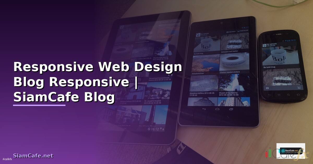
Responsive Web Design
Responsive Web Design Media Queries Flexbox CSS Grid Mobile-first Breakpoints Viewport Performance Testing
| Technique | ใช้ทำอะไร | CSS Property | Browser Support |
|---|---|---|---|
| Media Queries | ปรับ Style ตามขนาดจอ | @media (min-width: ...) | ทุก Browser |
| Flexbox | Layout 1 มิติ | display: flex | ทุก Browser |
| CSS Grid | Layout 2 มิติ | display: grid | ทุก Browser (IE11 partial) |
| Container Queries | ปรับตาม Container Size | @container | Chrome, Safari, Firefox |
| clamp() | Fluid Typography | font-size: clamp() | ทุก Browser |
| aspect-ratio | รักษาสัดส่วน | aspect-ratio: 16/9 | ทุก Browser |
CSS Layout
/* === Responsive Layout === */

/* Mobile-first Approach */
/* Base styles (Mobile) */
.container {
  width: 100%;
  padding: 0 16px;
  margin: 0 auto;
}

.grid {
  display: grid;
  grid-template-columns: 1fr;
  gap: 16px;
}

/* Tablet (768px+) */
@media (min-width: 768px) {
  .container { max-width: 720px; }
  .grid { grid-template-columns: repeat(2, 1fr); }
}

/* Desktop (1024px+) */
@media (min-width: 1024px) {
  .container { max-width: 960px; }
  .grid { grid-template-columns: repeat(3, 1fr); }
}

/* Large Desktop (1280px+) */
@media (min-width: 1280px) {
  .container { max-width: 1200px; }
  .grid { grid-template-columns: repeat(4, 1fr); }
}

/* Flexbox Navigation */
.nav {
  display: flex;
  flex-wrap: wrap;
  justify-content: space-between;
  align-items: center;
  padding: 12px 16px;
}

.nav-links {
  display: none; /* Hidden on mobile */
}

@media (min-width: 768px) {
  .nav-links {
    display: flex;
    gap: 24px;
  }
  .hamburger { display: none; }
}

/* Fluid Typography */
h1 { font-size: clamp(1.5rem, 4vw, 3rem); }
h2 { font-size: clamp(1.25rem, 3vw, 2rem); }
p  { font-size: clamp(1rem, 2vw, 1.125rem); }

/* Responsive Images */
img {
  max-width: 100%;
  height: auto;
  display: block;
}

/* Aspect Ratio */
.video-wrapper {
  aspect-ratio: 16 / 9;
  width: 100%;
}

/* Touch-friendly */
button, a {
  min-height: 44px;
  min-width: 44px;
  padding: 12px 24px;
}
Modern Techniques
/* === Modern Responsive CSS === */

/* Container Queries */
.card-container {
  container-type: inline-size;
  container-name: card;
}

@container card (min-width: 400px) {
  .card {
    display: flex;
    flex-direction: row;
  }
  .card-image { width: 40%; }
  .card-content { width: 60%; }
}

@container card (max-width: 399px) {
  .card {
    display: flex;
    flex-direction: column;
  }
  .card-image { width: 100%; }
}

/* CSS Grid Auto-fit */
.auto-grid {
  display: grid;
  grid-template-columns: repeat(auto-fit, minmax(250px, 1fr));
  gap: 24px;
}

/* Subgrid */
.parent-grid {
  display: grid;
  grid-template-columns: repeat(3, 1fr);
  gap: 16px;
}
.child-grid {
  display: grid;
  grid-template-columns: subgrid;
  grid-column: span 3;
}

/* :has() selector for responsive */
.sidebar:has(~ .main-content) {
  width: 300px;
}

/* Logical Properties (RTL support) */
.card {
  margin-inline: auto;
  padding-block: 16px;
  padding-inline: 24px;
  border-inline-start: 4px solid blue;
}
Performance
/* === Performance Optimization === */

/* Responsive Images with srcset */
/* <img
  srcset="image-320w.jpg 320w,
          image-768w.jpg 768w,
          image-1200w.jpg 1200w"
  sizes="(max-width: 320px) 280px,
         (max-width: 768px) 720px,
         1200px"
  src="image-1200w.jpg"
  alt="Description"
  loading="lazy"
  decoding="async"
/> */

/* <picture> for art direction */
/* <picture>
  <source media="(max-width: 767px)" srcset="mobile.webp" type="image/webp">
  <source media="(min-width: 768px)" srcset="desktop.webp" type="image/webp">
  <img src="fallback.jpg" alt="Description">
</picture> */

/* Preload critical CSS */
/* <link rel="preload" href="critical.css" as="style"> */

/* Font optimization */
/* @font-face {
  font-family: 'MyFont';
  src: url('font.woff2') format('woff2');
  font-display: swap;
} */

/* Reduce layout shift */
img, video {
  width: 100%;
  height: auto;
  aspect-ratio: attr(width) / attr(height);
}

/* Content-visibility for off-screen */
.below-fold {
  content-visibility: auto;
  contain-intrinsic-size: 0 500px;
}
เคล็ดลับ
- Mobile-first: ออกแบบ Mobile ก่อน ใช้ min-width Media Queries ขยายขึ้น
- clamp(): ใช้ clamp() สำหรับ Font Size ปรับตามจออัตโนมัติ
- auto-fit: ใช้ grid auto-fit minmax() ไม่ต้องเขียน Media Query
- Touch: ปุ่ม Link ต้องใหญ่อย่างน้อย 44x44px สำหรับ Mobile
- Test: ทดสอบบน Device จริง ไม่ใช่แค่ DevTools Emulator
การนำความรู้ไปประยุกต์ใช้งานจริง
แหล่งเรียนรู้ที่แนะนำ ได้แก่ Official Documentation ที่อัพเดทล่าสุดเสมอ Online Course จาก Coursera Udemy edX ช่อง YouTube คุณภาพทั้งไทยและอังกฤษ และ Community อย่าง Discord Reddit Stack Overflow ที่ช่วยแลกเปลี่ยนประสบการณ์กับนักพัฒนาทั่วโลก
เนื้อหาเกี่ยวข้อง — บทความที่เกี่ยวข้อง: QuestDB Time Series Internal Developer Platform
เปรียบเทียบข้อดีและข้อเสีย
จากตารางเปรียบเทียบจะเห็นว่าข้อดีมีมากกว่าข้อเสียอย่างชัดเจน โดยเฉพาะในแง่ของประสิทธิภาพและความสามารถในการ Scale สำหรับข้อเสียส่วนใหญ่สามารถแก้ไขได้ด้วยการเรียนรู้อย่างเป็นระบบและวางแผนทรัพยากรให้เหมาะสม
Responsive Web Design คืออะไร
ออกแบบเว็บทุกขนาดจอ Desktop Tablet Mobile Media Queries Flexible Grid Images Viewport Mobile-first Flexbox CSS Grid rem Breakpoints
แนะนำเพิ่มเติม — XM Signal
เนื้อหาเกี่ยวข้อง — อ่านต่อ: Midjourney Prompt Progressive Delivery: วิธีเพิ่มประสิทธิภาพการสร้างภาพ AI
Media Queries ใช้อย่างไร
@media min-width Mobile-first max-width Desktop-first Breakpoints sm 640 md 768 lg 1024 xl 1280 Tailwind CSS and รวมเงื่อนไข Tablet
Flexbox vs Grid ต่างกันอย่างไร
Flexbox 1 มิติ Navigation Card Row Grid 2 มิติ Page Layout Dashboard Column Row gap ใช้ร่วมกัน Grid Layout หลัก Flexbox Component ย่อย
แนะนำเพิ่มเติม — อ่านเพิ่มเติมที่ SiamCafeBook
เนื้อหาเกี่ยวข้อง — จอมอนิเตอร์ 24 นิ้ว
ทดสอบ Responsive อย่างไร
Chrome DevTools Device Toolbar Firefox BrowserStack Sauce Labs Device จริง iOS Android Lighthouse Mobile-Friendly Test Touch Target 44px Font 16px
สรุป
Responsive Web Design Media Queries Flexbox CSS Grid Mobile-first clamp() auto-fit Container Queries Performance Testing Touch-friendly
เนื้อหาเกี่ยวข้อง — จอมอนิเตอร์ 7 นิ้ว hdmi