SiamCafe.net Blog
Technology

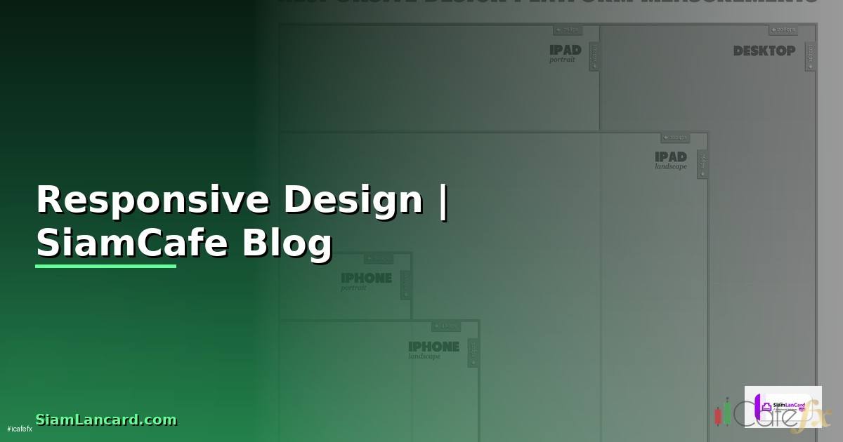
Responsive Design คือ ออกแบบเว็บให้แสดงผลดีบนทุกหน้าจอ

responsive design คอ
responsive design คือ | SiamCafe Blog
2026-04-19· อ. บอม — SiamCafe.net· 1,450 คำ

Responsive Design ?????????????????????

Responsive Web Design (RWD) ???????????????????????????????????????????????????????????????????????????????????????????????????????????????????????????????????????????????????????????????????????? ??????????????????????????????????????? ???????????????????????? ?????????????????????????????????????????????????????????????????????????????? ?????????????????? CSS Media Queries, Flexible Grids ????????? Fluid Images ???????????? layout ??????????????????????????????????????????????????????????????????

Ethan Marcotte ???????????????????????????????????????????????????????????????????????? Responsive Web Design ???????????? 2010 ???????????????????????????????????? 3 ?????????????????? Fluid Grids ???????????????????????? % ???????????? fr ????????? px ?????????????????? layout, Flexible Images ??????????????????????????????????????????????????? container, Media Queries ????????????????????? styles ????????? breakpoints

?????????????????????????????? responsive design ????????????????????????????????????????????????????????????????????????????????????????????? Google ????????? mobile-first indexing ?????????????????????????????? responsive ????????????????????? ranking ?????? search results ??????????????????????????????????????? 60% ?????????????????????????????????????????????????????? ?????????????????????????????????????????????????????????????????????????????? ????????????????????????????????????????????????

?????????????????????????????????????????? Media Queries

???????????????????????? Media Queries ?????????????????? responsive design

/* === Responsive Design Fundamentals === */

/* 1. Viewport Meta Tag (HTML) */
/*  */

/* 2. Common Breakpoints */
/* Mobile: 320px - 480px */
/* Tablet: 481px - 768px */
/* Laptop: 769px - 1024px */
/* Desktop: 1025px - 1200px */
/* Large: 1201px+ */

/* 3. Mobile-First Approach (recommended) */
/* Base styles for mobile */
.container {
    width: 100%;
    padding: 0 16px;
    margin: 0 auto;
}

.nav {
    display: flex;
    flex-direction: column;
    gap: 8px;
}

.card-grid {
    display: grid;
    grid-template-columns: 1fr;
    gap: 16px;
}

/* Tablet and up */
@media (min-width: 768px) {
    .container {
        max-width: 720px;
        padding: 0 24px;
    }
    
    .nav {
        flex-direction: row;
        gap: 24px;
    }
    
    .card-grid {
        grid-template-columns: repeat(2, 1fr);
        gap: 24px;
    }
}

/* Desktop and up */
@media (min-width: 1024px) {
    .container {
        max-width: 960px;
    }
    
    .card-grid {
        grid-template-columns: repeat(3, 1fr);
        gap: 32px;
    }
}

/* Large desktop */
@media (min-width: 1200px) {
    .container {
        max-width: 1140px;
    }
    
    .card-grid {
        grid-template-columns: repeat(4, 1fr);
    }
}

/* 4. Desktop-First Approach (legacy) */
/* Not recommended but sometimes needed for existing sites */
.legacy-container {
    max-width: 1140px;
}

@media (max-width: 1024px) {
    .legacy-container {
        max-width: 960px;
    }
}

@media (max-width: 768px) {
    .legacy-container {
        max-width: 100%;
        padding: 0 16px;
    }
}

/* 5. Feature Queries */
@supports (display: grid) {
    .card-grid {
        display: grid;
    }
}

/* 6. Orientation Queries */
@media (orientation: landscape) {
    .hero {
        height: 50vh;
    }
}

@media (orientation: portrait) {
    .hero {
        height: 70vh;
    }
}

/* 7. Dark Mode */
@media (prefers-color-scheme: dark) {
    :root {
        --bg-color: #1a1a2e;
        --text-color: #e0e0e0;
    }
}

/* 8. Reduced Motion */
@media (prefers-reduced-motion: reduce) {
    * {
        animation: none !important;
        transition: none !important;
    }
}

CSS Grid ????????? Flexbox Layout

??????????????? responsive layouts ???????????? modern CSS

/* === CSS Grid & Flexbox Responsive Layout === */

/* 1. Responsive Grid without Media Queries */
.auto-grid {
    display: grid;
    grid-template-columns: repeat(auto-fit, minmax(300px, 1fr));
    gap: 24px;
}

/* Cards automatically wrap based on available space */
/* 1 column on mobile, 2 on tablet, 3-4 on desktop */

/* 2. Holy Grail Layout */
.page {
    display: grid;
    grid-template-areas:
        "header header header"
        "nav    main   aside"
        "footer footer footer";
    grid-template-columns: 200px 1fr 200px;
    grid-template-rows: auto 1fr auto;
    min-height: 100vh;
}

.page-header { grid-area: header; }
.page-nav { grid-area: nav; }
.page-main { grid-area: main; }
.page-aside { grid-area: aside; }
.page-footer { grid-area: footer; }

@media (max-width: 768px) {
    .page {
        grid-template-areas:
            "header"
            "nav"
            "main"
            "aside"
            "footer";
        grid-template-columns: 1fr;
    }
}

/* 3. Flexbox Navigation */
.navbar {
    display: flex;
    justify-content: space-between;
    align-items: center;
    padding: 16px;
    flex-wrap: wrap;
}

.nav-links {
    display: flex;
    gap: 16px;
    list-style: none;
}

@media (max-width: 768px) {
    .navbar {
        flex-direction: column;
        gap: 16px;
    }
    
    .nav-links {
        flex-direction: column;
        width: 100%;
        text-align: center;
    }
}

/* 4. Responsive Card Component */
.card {
    display: flex;
    flex-direction: column;
    border-radius: 12px;
    overflow: hidden;
    box-shadow: 0 2px 8px rgba(0, 0, 0, 0.1);
    transition: transform 0.2s;
}

.card:hover {
    transform: translateY(-4px);
}

.card-image {
    width: 100%;
    aspect-ratio: 16 / 9;
    object-fit: cover;
}

.card-content {
    padding: 16px;
    flex: 1;
    display: flex;
    flex-direction: column;
}

.card-title {
    font-size: clamp(1rem, 2.5vw, 1.5rem);
    margin-bottom: 8px;
}

/* 5. Container Queries (Modern CSS) */
.card-container {
    container-type: inline-size;
    container-name: card;
}

@container card (min-width: 400px) {
    .card {
        flex-direction: row;
    }
    
    .card-image {
        width: 200px;
        aspect-ratio: 1;
    }
}

/* 6. Fluid Typography with clamp() */
h1 { font-size: clamp(1.5rem, 4vw, 3rem); }
h2 { font-size: clamp(1.25rem, 3vw, 2rem); }
p { font-size: clamp(0.875rem, 1.5vw, 1.125rem); }

Responsive Images ????????? Typography

????????????????????????????????????????????????????????????????????? responsive

#!/usr/bin/env python3
# responsive_assets.py ??? Responsive Asset Management
import json
import logging
from typing import Dict, List

logging.basicConfig(level=logging.INFO)
logger = logging.getLogger("responsive")

class ResponsiveAssetManager:
    def __init__(self):
        self.breakpoints = [320, 640, 768, 1024, 1280, 1920]
    
    def generate_picture_element(self, image_path, alt_text):
        """Generate responsive  element"""
        base_name = image_path.rsplit(".", 1)[0]
        ext = image_path.rsplit(".", 1)[1]
        
        sources = []
        for bp in self.breakpoints:
            sources.append({
                "srcset": f"{base_name}-{bp}w.webp",
                "media": f"(max-width: {bp}px)",
                "type": "image/webp",
            })
        
        return {
            "html": f"""


  {alt_text}
""",
            "sizes": self.breakpoints,
        }
    
    def typography_scale(self):
        """Fluid typography scale"""
        return {
            "system": "clamp(min, preferred, max)",
            "scale": {
                "h1": {"mobile": "1.75rem", "desktop": "3rem", "css": "clamp(1.75rem, 4vw, 3rem)"},
                "h2": {"mobile": "1.5rem", "desktop": "2.25rem", "css": "clamp(1.5rem, 3vw, 2.25rem)"},
                "h3": {"mobile": "1.25rem", "desktop": "1.75rem", "css": "clamp(1.25rem, 2.5vw, 1.75rem)"},
                "body": {"mobile": "0.875rem", "desktop": "1.125rem", "css": "clamp(0.875rem, 1.5vw, 1.125rem)"},
                "small": {"mobile": "0.75rem", "desktop": "0.875rem", "css": "clamp(0.75rem, 1vw, 0.875rem)"},
            },
            "line_height": {
                "heading": 1.2,
                "body": 1.6,
                "tight": 1.1,
            },
        }
    
    def performance_checklist(self):
        return {
            "images": [
                "????????? WebP/AVIF format (30-50% smaller than JPEG)",
                "????????? srcset ?????????????????? responsive images",
                "????????? loading='lazy' ?????????????????? below-fold images",
                "????????? width/height attributes ????????????????????? layout shift",
                "????????? aspect-ratio ?????? CSS",
            ],
            "css": [
                "????????? clamp() ????????? media queries ?????????????????? typography",
                "????????? CSS Grid auto-fit/auto-fill",
                "????????? Container Queries ?????????????????? component-level responsive",
                "Minimize CSS (remove unused styles)",
            ],
            "performance": [
                "Core Web Vitals: LCP < 2.5s, FID < 100ms, CLS < 0.1",
                "??????????????????????????? Lighthouse",
                "??????????????????????????? Chrome DevTools Device Mode",
                "??????????????????????????????????????????????????????",
            ],
        }

manager = ResponsiveAssetManager()
picture = manager.generate_picture_element("/images/hero.jpg", "Hero image")
print("Picture Element:", picture["html"])

typo = manager.typography_scale()
print("\nTypography:", json.dumps(typo["scale"]["h1"], indent=2))

Mobile-First Development

?????????????????? Mobile-First

/* === Mobile-First Development === */

/* 1. Base Reset */
*, *::before, *::after {
    box-sizing: border-box;
    margin: 0;
    padding: 0;
}

html {
    font-size: 16px;
    -webkit-text-size-adjust: 100%;
}

img {
    max-width: 100%;
    height: auto;
    display: block;
}

/* 2. Mobile Base (no media query needed) */
body {
    font-family: -apple-system, BlinkMacSystemFont, 'Segoe UI', Roboto, sans-serif;
    line-height: 1.6;
    color: #333;
    background: #fff;
}

.container {
    width: 100%;
    padding-inline: 1rem;
    margin-inline: auto;
}

/* 3. Touch-Friendly */
button, a {
    min-height: 44px;
    min-width: 44px;
}

input, select, textarea {
    font-size: 16px; /* Prevents iOS zoom on focus */
    padding: 12px;
    width: 100%;
}

/* 4. Hamburger Menu */
.mobile-menu-btn {
    display: block;
    background: none;
    border: none;
    cursor: pointer;
    padding: 8px;
}

.nav-menu {
    display: none;
    flex-direction: column;
    position: absolute;
    top: 60px;
    left: 0;
    right: 0;
    background: #fff;
    box-shadow: 0 4px 6px rgba(0, 0, 0, 0.1);
    z-index: 100;
}

.nav-menu.active {
    display: flex;
}

/* Tablet: show nav, hide hamburger */
@media (min-width: 768px) {
    .mobile-menu-btn {
        display: none;
    }
    
    .nav-menu {
        display: flex;
        flex-direction: row;
        position: static;
        box-shadow: none;
    }
}

/* 5. Responsive Table */
.table-responsive {
    overflow-x: auto;
    -webkit-overflow-scrolling: touch;
}

@media (max-width: 768px) {
    table.stack-on-mobile thead {
        display: none;
    }
    
    table.stack-on-mobile tr {
        display: block;
        margin-bottom: 16px;
        border: 1px solid #ddd;
        border-radius: 8px;
    }
    
    table.stack-on-mobile td {
        display: flex;
        justify-content: space-between;
        padding: 8px 16px;
        border: none;
    }
    
    table.stack-on-mobile td::before {
        content: attr(data-label);
        font-weight: bold;
    }
}

/* 6. Spacing Scale (Fluid) */
:root {
    --space-xs: clamp(0.25rem, 0.5vw, 0.5rem);
    --space-sm: clamp(0.5rem, 1vw, 0.75rem);
    --space-md: clamp(1rem, 2vw, 1.5rem);
    --space-lg: clamp(1.5rem, 3vw, 2.5rem);
    --space-xl: clamp(2rem, 5vw, 4rem);
}

Testing ????????? Performance

??????????????? responsive design

#!/usr/bin/env python3
# responsive_testing.py ??? Responsive Design Testing
import json
import logging

logging.basicConfig(level=logging.INFO)
logger = logging.getLogger("testing")

class ResponsiveTester:
    def __init__(self):
        self.devices = []
    
    def test_devices(self):
        return {
            "mobile": [
                {"name": "iPhone SE", "width": 375, "height": 667, "dpr": 2},
                {"name": "iPhone 14", "width": 390, "height": 844, "dpr": 3},
                {"name": "iPhone 14 Pro Max", "width": 430, "height": 932, "dpr": 3},
                {"name": "Samsung Galaxy S23", "width": 360, "height": 780, "dpr": 3},
                {"name": "Pixel 7", "width": 412, "height": 915, "dpr": 2.625},
            ],
            "tablet": [
                {"name": "iPad Mini", "width": 768, "height": 1024, "dpr": 2},
                {"name": "iPad Air", "width": 820, "height": 1180, "dpr": 2},
                {"name": "iPad Pro 12.9", "width": 1024, "height": 1366, "dpr": 2},
            ],
            "desktop": [
                {"name": "Laptop 13\"", "width": 1280, "height": 800, "dpr": 1},
                {"name": "Desktop HD", "width": 1920, "height": 1080, "dpr": 1},
                {"name": "Desktop 4K", "width": 3840, "height": 2160, "dpr": 2},
            ],
        }
    
    def testing_checklist(self):
        return {
            "visual": [
                "Layout ????????????????????????????????? breakpoint",
                "Text ??????????????????????????????????????? ??????????????????????????????????????? (min 14px)",
                "Images ?????????????????? container",
                "??????????????? horizontal scroll ?????? mobile",
                "Touch targets >= 44x44px",
                "Forms ????????????????????????????????? mobile",
            ],
            "performance": [
                "LCP (Largest Contentful Paint) < 2.5s",
                "FID (First Input Delay) < 100ms",
                "CLS (Cumulative Layout Shift) < 0.1",
                "Total page weight < 3MB on mobile",
                "Images optimized (WebP, lazy loading)",
            ],
            "tools": [
                "Chrome DevTools Device Mode",
                "Lighthouse (Performance audit)",
                "PageSpeed Insights (Google)",
                "BrowserStack (Real device testing)",
                "Responsively App (Multi-device preview)",
            ],
        }

tester = ResponsiveTester()
devices = tester.test_devices()
print("Mobile devices:", json.dumps(devices["mobile"][:3], indent=2))

checklist = tester.testing_checklist()
print("\nVisual checks:", json.dumps(checklist["visual"], indent=2, ensure_ascii=False))

FAQ ??????????????????????????????????????????

Q: Mobile-First ????????? Desktop-First ???????????????????????????????????????????

A: Mobile-First ??????????????? base CSS ?????????????????? mobile ???????????? ????????????????????? min-width media queries ??????????????? styles ???????????????????????????????????????????????????????????? ??????????????? force ?????????????????? content ???????????????????????????????????? performance ???????????????????????? mobile ??????????????? load CSS ???????????????????????? SEO ?????? (Google mobile-first indexing) Desktop-First ??????????????? base CSS ?????????????????? desktop ???????????? ????????????????????? max-width media queries ?????? styles ???????????????????????????????????????????????? ????????????????????? mobile ???????????? load CSS ????????????????????????????????? override ??????????????? Mobile-First ?????????????????????????????? project ????????????

Q: Container Queries ????????????????????? ????????????????????? Media Queries ??????????????????????

A: Media Queries ?????? viewport size (??????????????????????????????) Component ????????????????????????????????????????????? responsive ?????????????????????????????????????????????????????? sidebar vs main content Container Queries ??????????????????????????? parent container ??????????????? component responsive ????????? context ????????????????????? ???????????????????????????????????????????????????????????? ???????????? card ?????? sidebar 300px ????????????????????? vertical card ?????? main content 800px ????????????????????? horizontal Container Queries ????????????????????????????????? reusable components ??????????????????????????????????????? ???????????????????????? browsers ?????????????????????????????? (Chrome, Firefox, Safari, Edge)

Q: Breakpoints ????????????????????????????????????????????????????

A: ??????????????? breakpoints ???????????????????????????????????????????????? ???????????????????????????????????? content ???????????????????????????????????????????????? ??????????????? layout ?????????????????????????????????????????? ???????????? breakpoint ????????????????????? Breakpoints ????????????????????????????????????????????? 480px (mobile landscape), 768px (tablet), 1024px (laptop), 1280px (desktop) ??????????????????????????? CSS Grid auto-fit ????????? clamp() ??????????????????????????????????????? media queries ??????????????????????????? layout ????????????????????? ?????? breakpoints ??????????????????????????????????????? ???????????????????????????????????? maintain ????????????

Q: ???????????????????????????????????? CLS (Cumulative Layout Shift) ??????????

A: CLS ????????????????????? elements ?????????????????????????????????????????????????????? page load ??????????????????????????? ??????????????? width/height ????????? img ????????? video elements ???????????? ????????? aspect-ratio ?????? CSS ??????????????????????????? ad slots ???????????????????????? ????????? font-display swap ?????????????????? web fonts (????????????????????? FOIT) Preload critical fonts ????????? inject content above the fold ???????????? page load ????????? transform animations ????????? top/left (????????? trigger layout) ??????????????????????????? Lighthouse ???????????? PageSpeed Insights ?????? CLS score

📖 บทความที่เกี่ยวข้อง

responsive web design template freeอ่านบทความ → React Server Components Multi-tenant Designอ่านบทความ → Prometheus PromQL Event Driven Designอ่านบทความ → Healthchecks.io Domain Driven Design DDDอ่านบทความ → Webhook Design Pattern Compliance Automationอ่านบทความ →

📚 ดูบทความทั้งหมด →